DP – Catégories
Presents categories from an existing taxonomy or manual entries. Choose Source before design, then entries or filters. Twenty designs range from lists to mosaics. In manual mode, use it for services or topics; test links and layouts that need photographs.
What you fill in
The content fields of this widget, in the order of the Elementor panel. Appearance settings are gathered in the reference.
En-tête
| Label in the plugin | How to complete it |
|---|---|
| Sur-titre | Enter short, clear text. |
| Titre | Enter short, clear text. |
| Texte d’introduction | Enter the text, then check its length in the preview. |
| Alignement de l’en-tête | Choose a position or alignment that supports reading. Options: Gauche · Centre. |
| Texte du lien « voir tout » | Enter short, clear text. |
| Lien « voir tout » | Enter the full destination and test the link in the correct language. |
Catégories à afficher
| Label in the plugin | How to complete it |
|---|---|
| Source | Choose an available option and check its effect in the preview. Options: Une taxonomie produit · Saisie manuelle. |
| Taxonomie | Choose an available option and check its effect in the preview. Options: Gammes · Solutions · Espèces. Visible when “Source” is Une taxonomie produit. |
| Limiter à certains termes (Gammes) | Vide = toutes les catégories de la taxonomie. L’ordre choisi ici est respecté. Options: Anti-tox · Anxiété · Épilepsie · Ophtalmologie. Visible when “Source” is Une taxonomie produit and “Taxonomie” is Gammes. |
| Limiter à certains termes (Solutions) | Vide = toutes les catégories de la taxonomie. L’ordre choisi ici est respecté. Visible when “Source” is Une taxonomie produit and “Taxonomie” is Solutions. |
| Limiter à certains termes (Espèces) | Vide = toutes les catégories de la taxonomie. L’ordre choisi ici est respecté. Options: Cat · Cow · Dog · Goat · Hamster · Horse · Lizard · Mouse …. Visible when “Source” is Une taxonomie produit and “Taxonomie” is Espèces. |
| Masquer les catégories sans produit | Turn the option on or off, then check what appears. Visible when “Source” is Une taxonomie produit. |
| Tri | Choose an available option and check its effect in the preview. Options: Nom · Nombre de produits · Identifiant (slug). Visible when “Source” is Une taxonomie produit. |
| Sens du tri | Choose an available option and check its effect in the preview. Options: Croissant · Décroissant. Visible when “Source” is Une taxonomie produit. |
| Nombre maximum de catégories | 0 = pas de limite. Visible when “Source” is Une taxonomie produit. |
| Catégories | Open each entry; add, duplicate or reorder the items you need. Visible when “Source” is Saisie manuelle. |
| ↳ Titre | Enter short, clear text. |
| ↳ Description | Enter the text, then check its length in the preview. |
| ↳ Image ou logo | Choose the appropriate media file and check the result. |
| ↳ Photo de gamme / visuel de dôme | Utilisé par les designs photographiques (Dôme, Éditorial, Galerie, Portails, Mosaïque, Panorama et Accordéon). Vide : le logo est conservé sans recadrage dans les nouveaux designs. |
| ↳ Lien | Enter the full destination and test the link in the correct language. |
| ↳ Badge (optionnel) | Enter short, clear text. |
| ↳ Couleur d’accent | Empty: the design colour applies. Check the contrast against the background. |
Design
| Label in the plugin | How to complete it |
|---|---|
| Design des cartes | Choose an available option and check its effect in the preview. Options: Carte — fond blanc, liseré de couleur · Tuile — aplat de la couleur de gamme, texte calculé · Média — image de couverture en haut · Épuré — filet en haut, sans fond · Côte à côte — logo à gauche, texte à droite · Overlay — titre posé sur l’image · Liste — une gamme par ligne, pleine largeur · Centré — pastille et texte centrés …. |
| Hauteur du visuel | From 100 to 480 px. Empty: the design value applies. Visible when “Design des cartes” is Dôme, Éditorial, Galerie, Portails, Mosaïque, Panorama, Accordéon. |
| Arrondi du visuel | From 0 to 200 px. Empty: the design value applies. Visible when “Design des cartes” is Dôme, Éditorial, Galerie, Mosaïque, Panorama, Accordéon. |
| Visuel de dôme par défaut | La photo de chaque dôme se choisit dans Produits → Gammes → « Visuel de dôme ». Faute de photo, le bloc pose l'un des cinq dégradés de dôme livrés avec la charte, en tournant d'une gamme à l'autre. Visible when “Design des cartes” is Dôme, Éditorial, Galerie, Portails, Mosaïque, Panorama, Accordéon. |
| Cartes par rangée (maximum) | Avec moins de catégories que ce maximum, la grille se resserre et se centre. Options: 2 · 3 · 4. Visible when “Design des cartes” is not Éditorial, Cadre dégradé, Galerie, Portails, Rubans, Mosaïque, Catalogue, Panorama, Totems, Accordéon. |
| Largeur maximale d’une carte | Empêche deux ou trois cartes de s’étirer démesurément sur un grand écran. Visible when “Design des cartes” is not Éditorial, Cadre dégradé, Galerie, Portails, Rubans, Mosaïque, Catalogue, Panorama, Totems, Accordéon. |
| Afficher l’image ou le logo | Turn the option on or off, then check what appears. |
| Afficher la description | Turn the option on or off, then check what appears. |
| Afficher le nombre de produits | Turn the option on or off, then check what appears. Visible when “Source” is Une taxonomie produit. |
| Libellé du compteur (pluriel) | Enter short, clear text. Visible when “Source” is Une taxonomie produit and “Afficher le nombre de produits” is enabled. |
| Libellé du compteur (singulier) | Enter short, clear text. Visible when “Source” is Une taxonomie produit and “Afficher le nombre de produits” is enabled. |
| Afficher la flèche de lien | Turn the option on or off, then check what appears. |
| Texte du lien de carte | Vide = seule la flèche est affichée. |
| Couleur d’accent des cartes | Les couleurs de gamme se règlent dans Produits → Couleurs de gamme. Options: Couleur de la gamme · Couleur primaire de la charte. |
Available designs
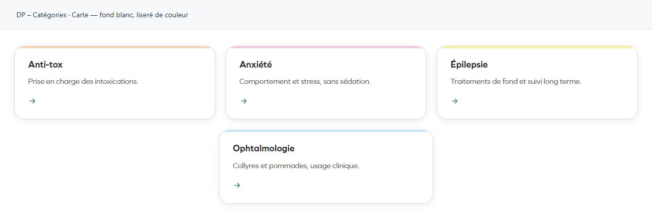
Carte — fond blanc, liseré de couleur
A separate card distinguishes each entry. Keep descriptions reasonably similar in length.
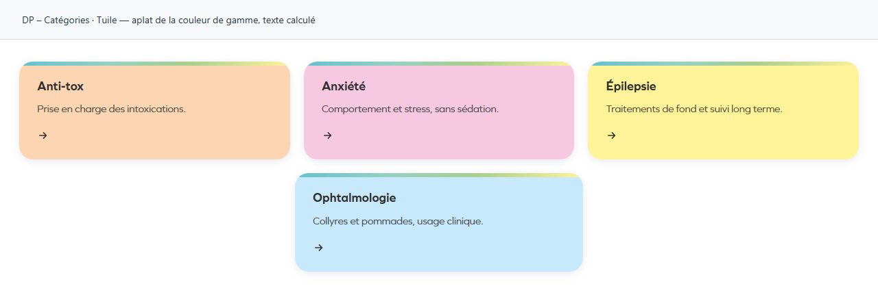
Tuile — aplat de la couleur de gamme, texte calculé
A solid colour surface for each entry. Keep headings short and readable against it.
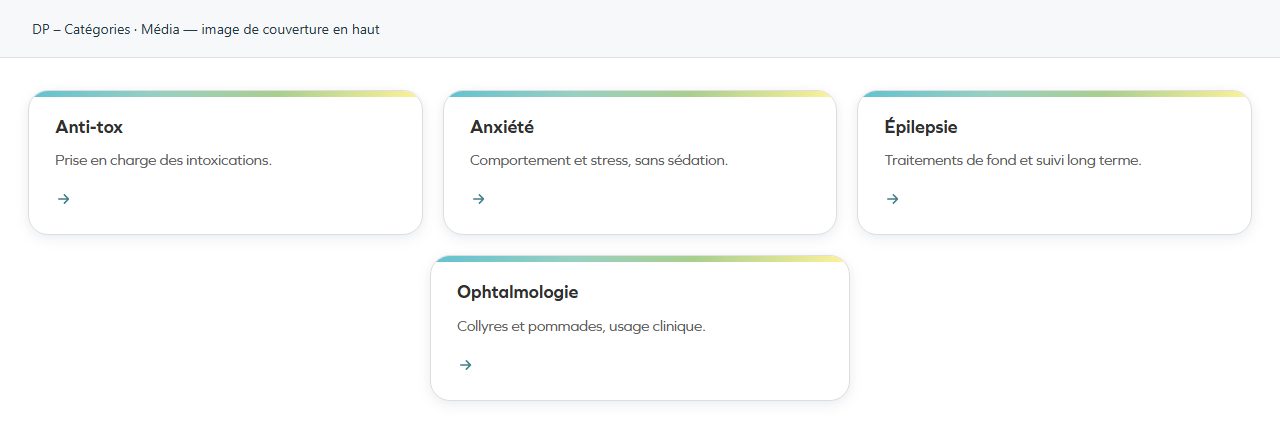
Média — image de couverture en haut
A cover image precedes the text. Choose imagery that actually explains the subject.
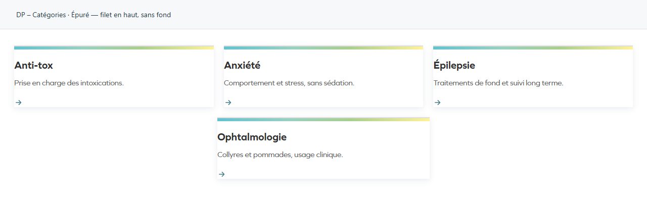
Épuré — filet en haut, sans fond
A rule structures the entry without a background panel. Suitable for a light page and concise copy.
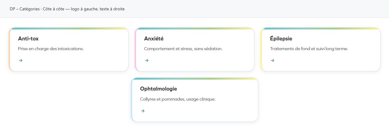
Côte à côte — logo à gauche, texte à droite
Image and text are arranged side by side. Compare their visual weight to avoid imbalance.
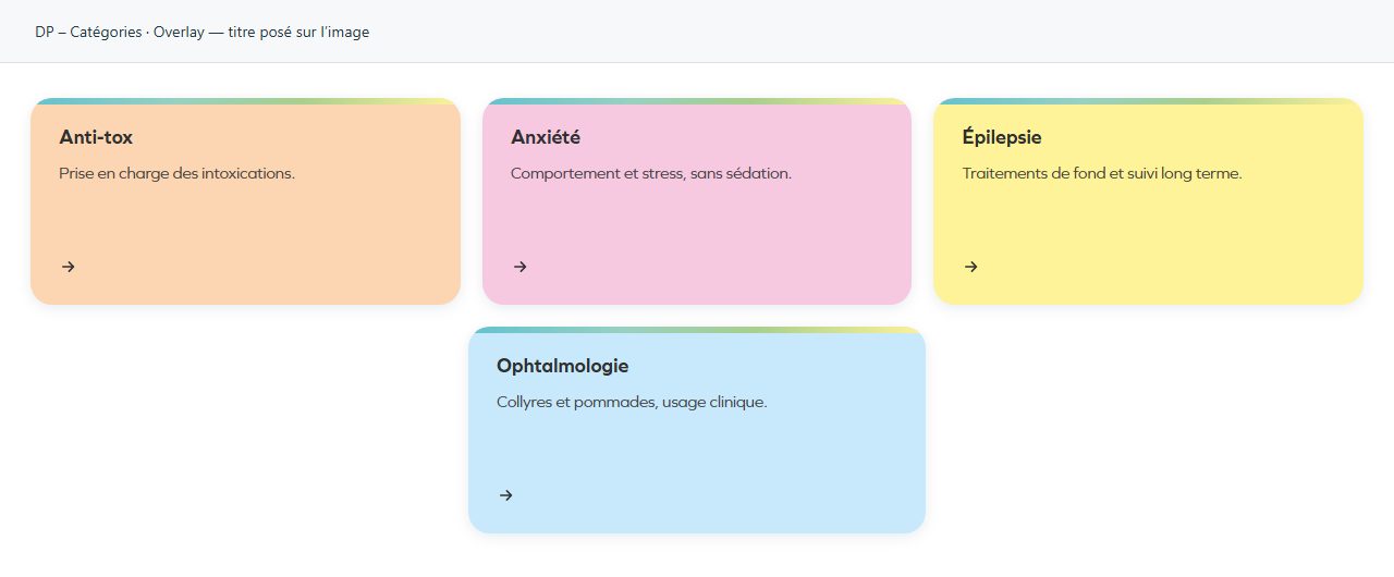
Overlay — titre posé sur l’image
Text overlays the image. A quiet area behind the words improves readability.
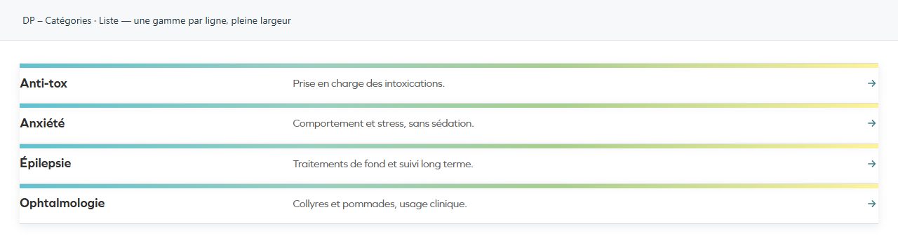
Liste — une gamme par ligne, pleine largeur
One entry per row: easy to scan as the list grows.
Centré — pastille et texte centrés
Centred icon or image and text. Useful for a few short entries of equal importance.
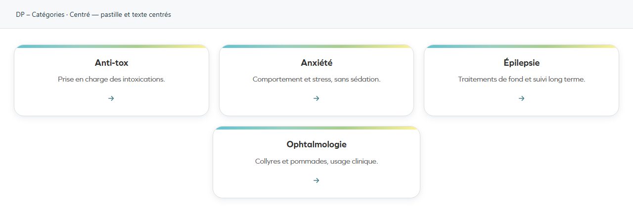
Teinté — fond dans la couleur de gamme, bord marqué
Tinted surface with a defined edge. Content remains central in a softer composition.
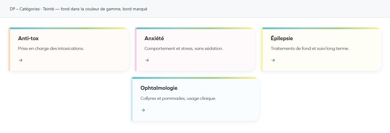
Dôme — visuel arrondi, texte dessous, sans carte
The dome silhouette becomes the visual marker. Check cropping within the rounded shape.
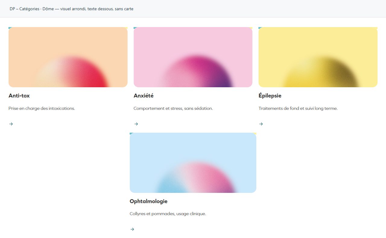
Éditorial — grands visuels alternés
Large alternating images give each entry more space. Reserve this design for a short selection.
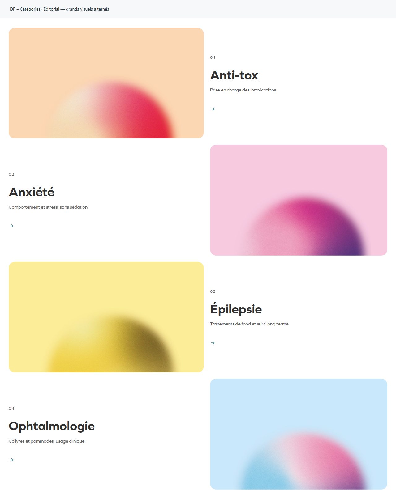
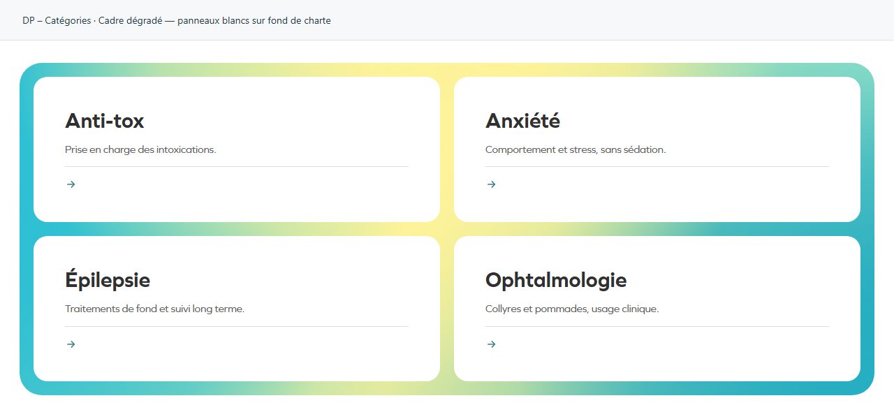
Cadre dégradé — panneaux blancs sur fond de charte
White panels on a gradient frame. The frame visually groups entries while keeping content distinct.
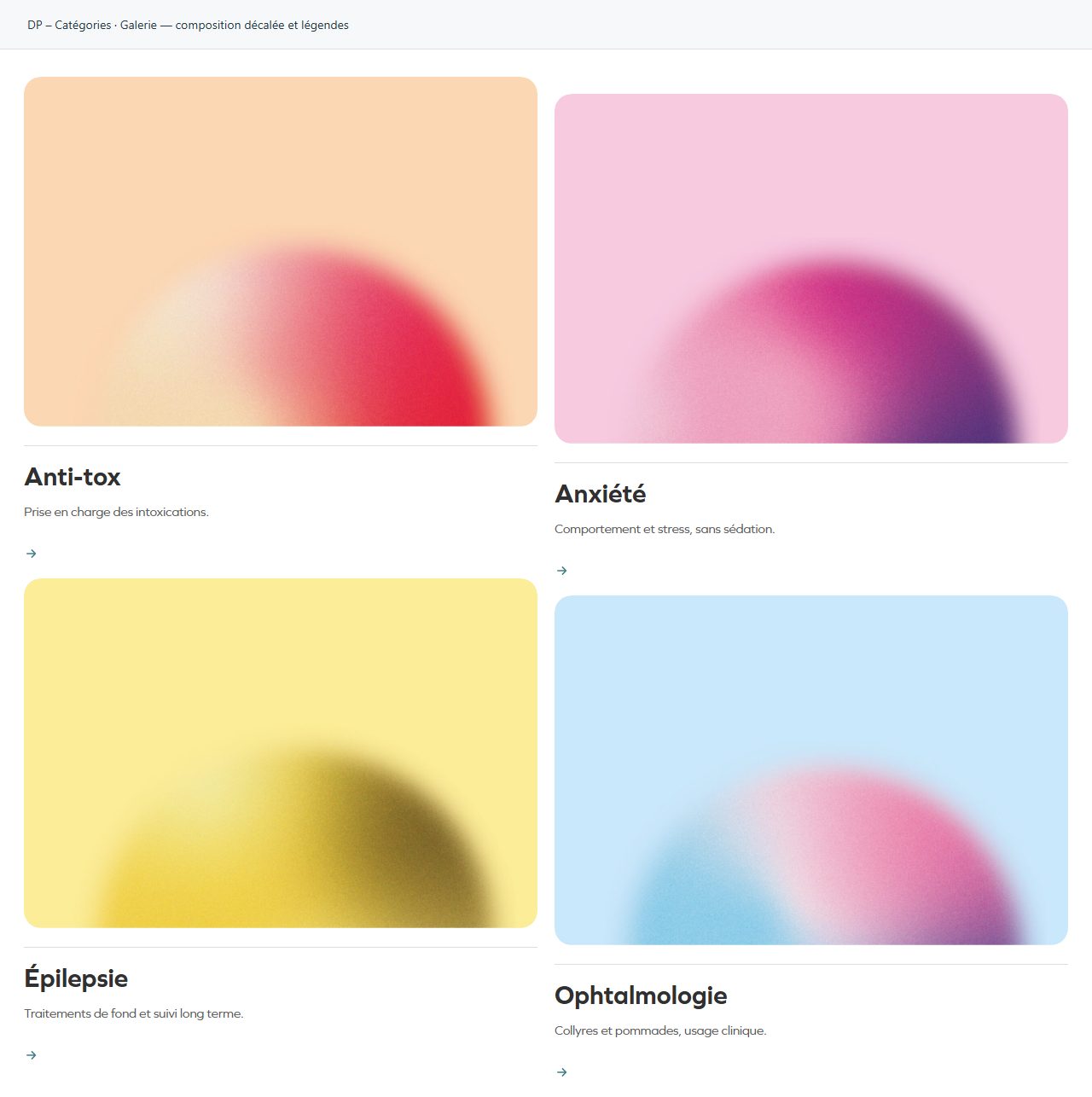
Galerie — composition décalée et légendes
Offset composition with captions. Choose a coherent set of images rather than unrelated crops.
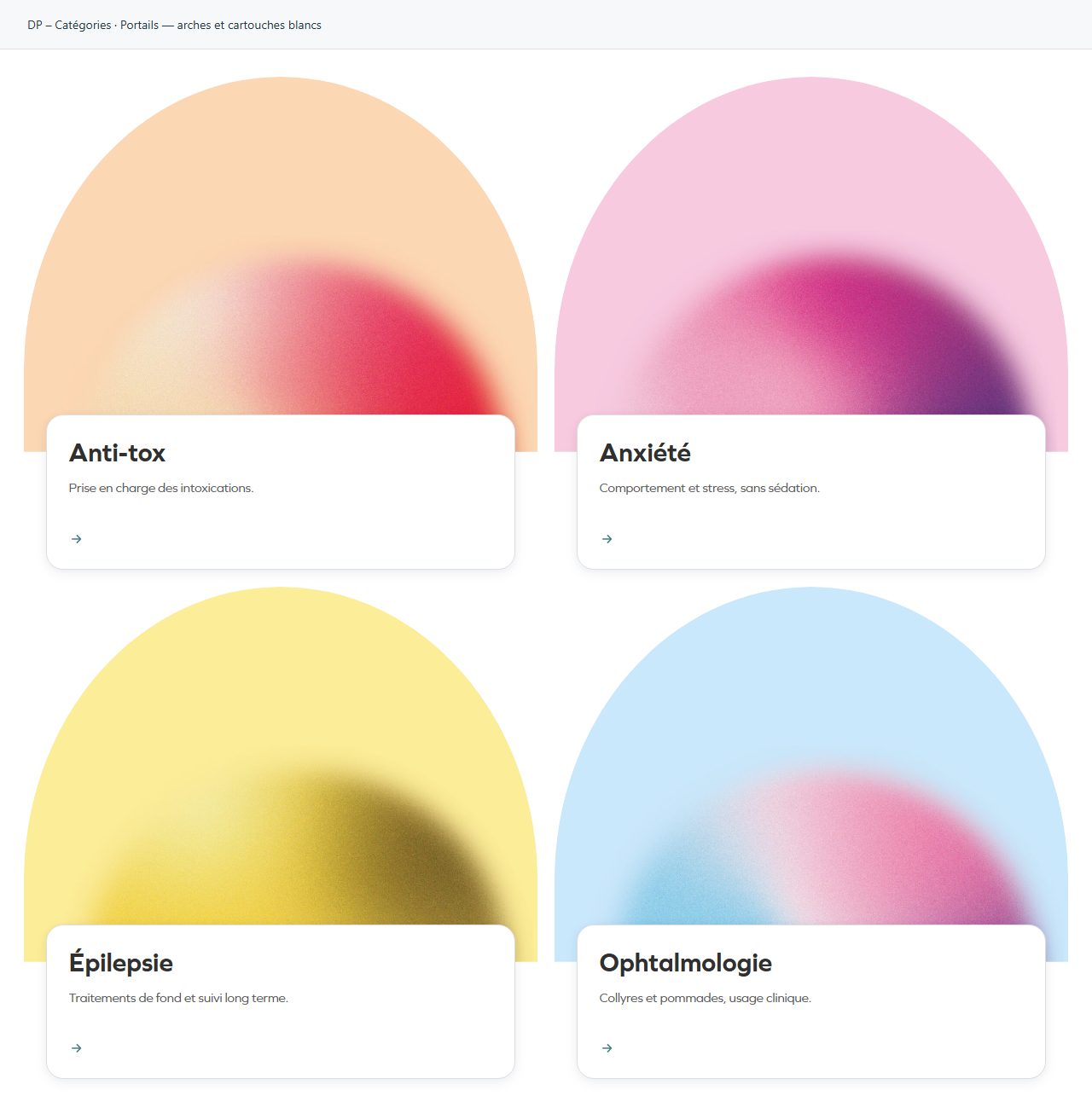
Portails — arches et cartouches blancs
Arches and white labels suggest entry points. Make destinations immediately understandable.
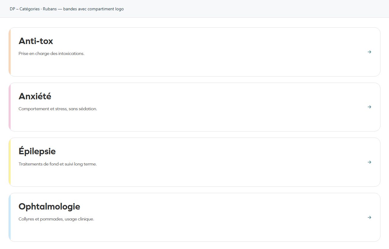
Rubans — bandes avec compartiment logo
Bands with a logo compartment. Useful for identifying several themes quickly without long text.
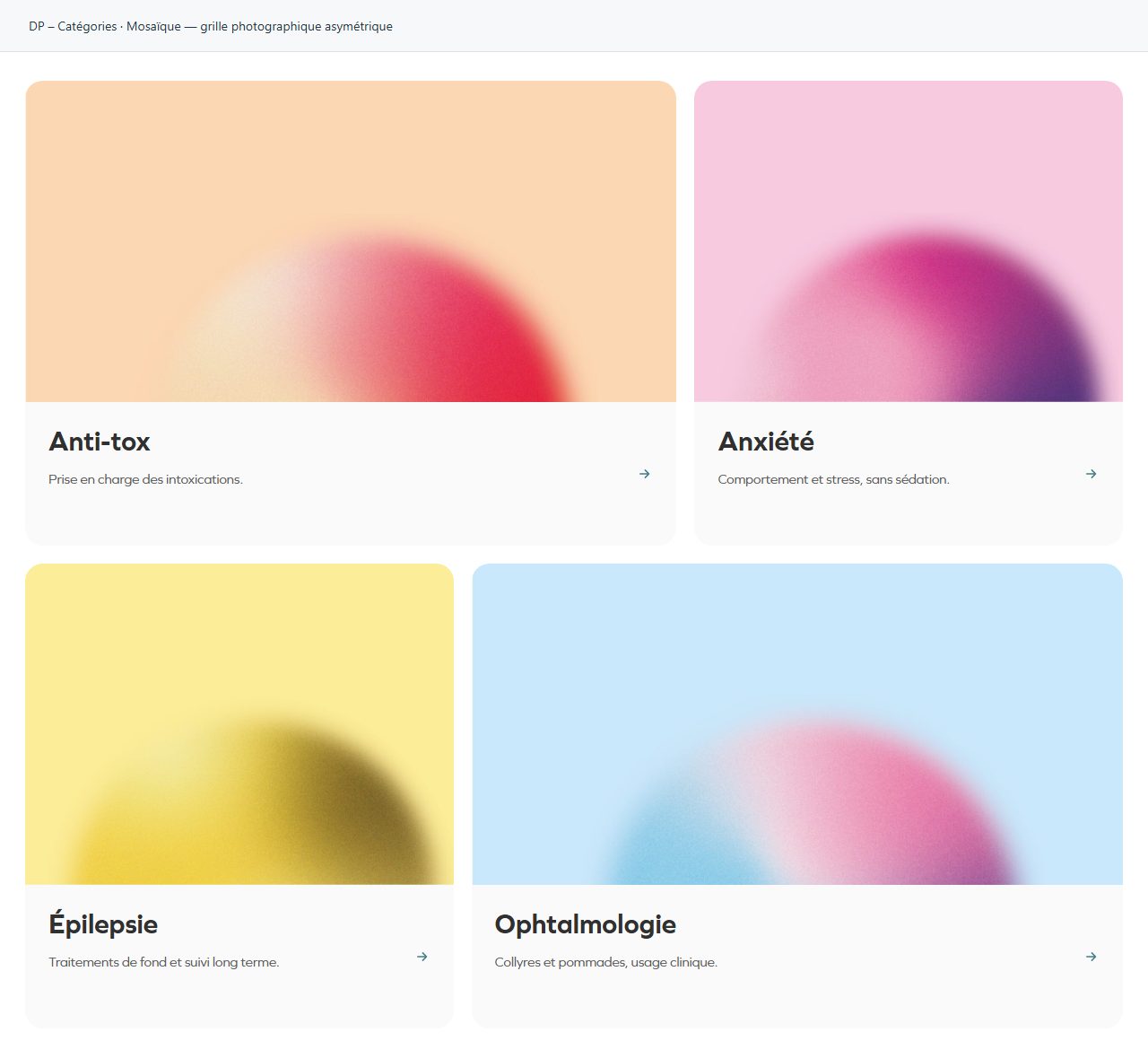
Mosaïque — grille photographique asymétrique
Asymmetric photographic grid. Images lead the composition; check mobile reading order.
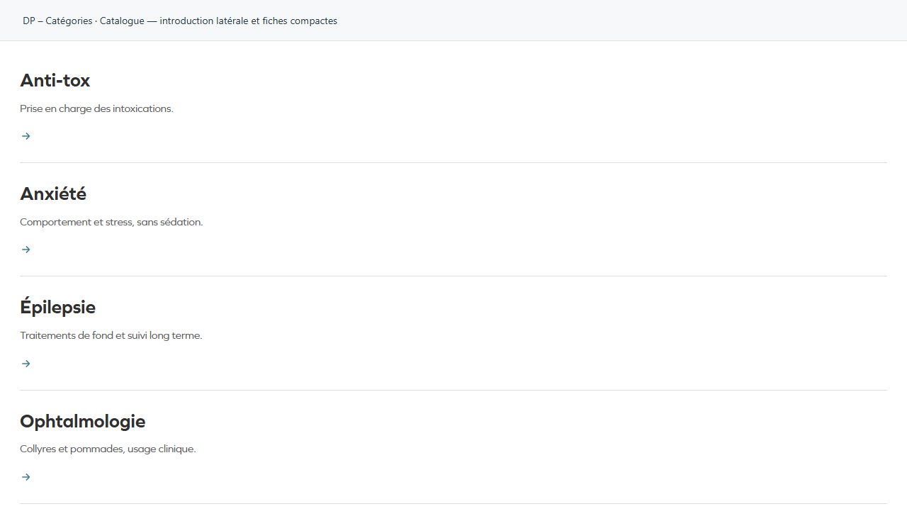
Catalogue — introduction latérale et fiches compactes
Side introduction with compact entries. Useful when several choices share a common explanation.
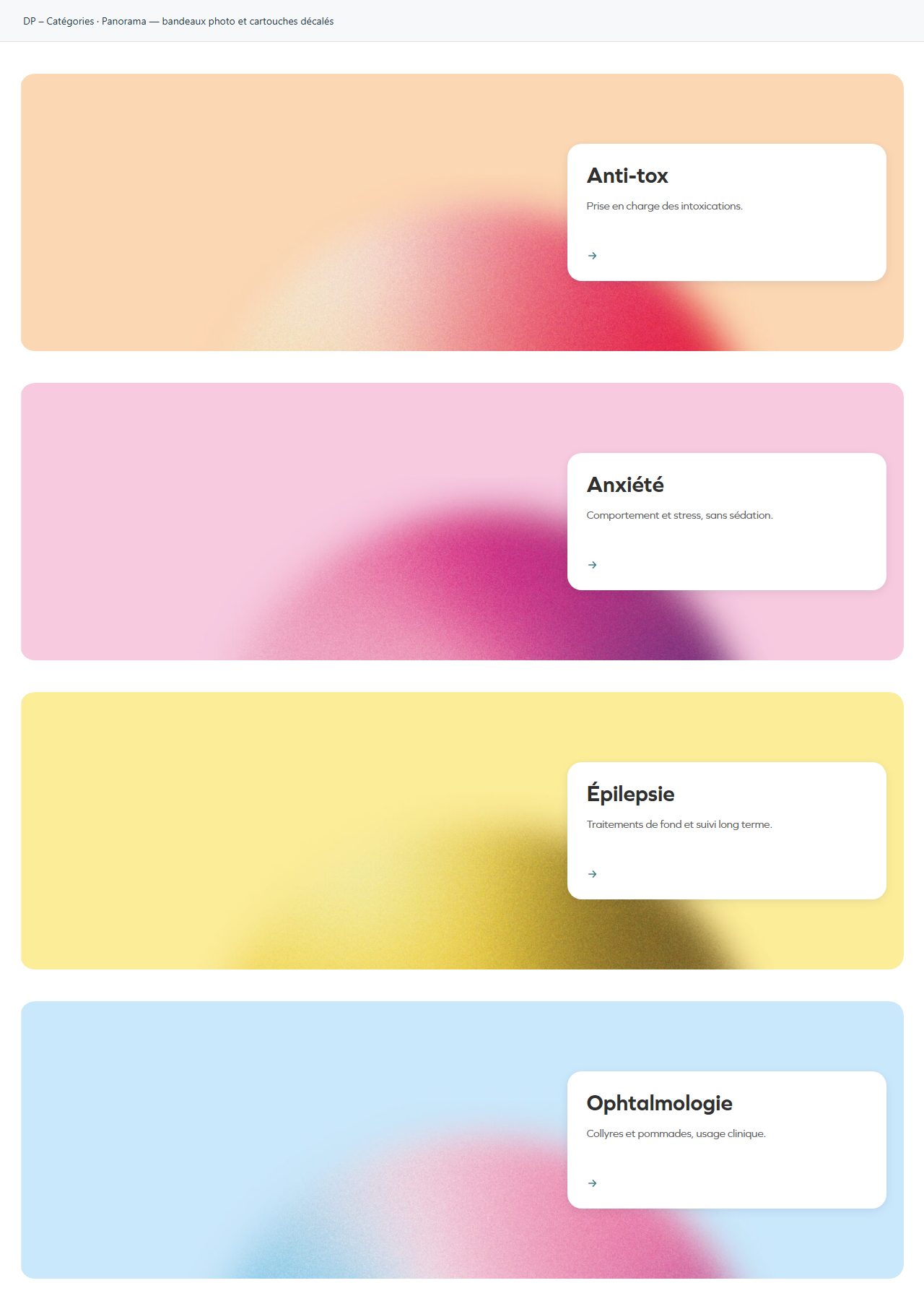
Panorama — bandeaux photo et cartouches décalés
A wide image opens the entry; make sure panoramic cropping preserves the subject.
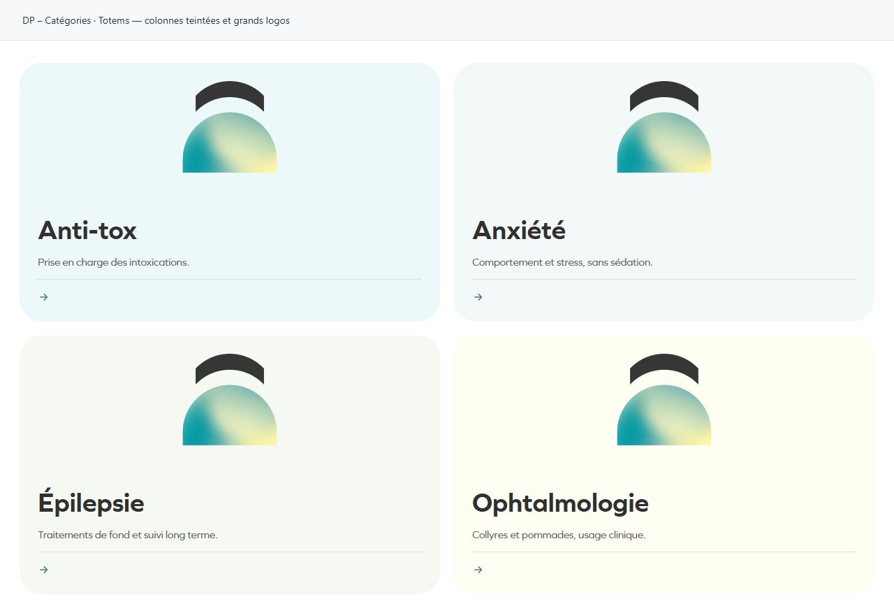
Totems — colonnes teintées et grands logos
Tinted columns with large logos. Prefer clean logo assets and short headings.
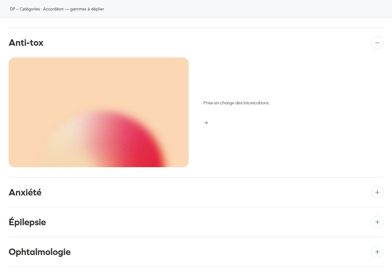
Accordéon — gammes à déplier
Entries expand in place. Test opening, closing and each entry’s destination link.