Rebuild pages and create with Elementor
43 widgets · 118 widget and variant views · every plugin setting · French editor screenshots
Widget gallery →How to use this guide
This guide helps you rebuild pages using the new Dômes Pharma identity and maintain them afterwards. No coding knowledge is required. Start with chapters 2 to 8 to edit your first page, then use the procedures relevant to your work. Separate appendices cover all 47 plugin widgets and their illustrated design variants.
Screenshots retain the French labels of the installed plugin. They illustrate layouts: do not copy their figures, contact details or product information without approval. Widget names stay in French so you can find the exact item in the editor.
Administrator settings for ranges, range colours, brand colours and species are outside this guide. You may select values already prepared for a page; creating and configuring them remains the administrator’s responsibility.
Understand WordPress and Elementor
WordPress stores pages, posts, products and media. Elementor controls their presentation. A container groups elements and arranges them; a widget, also called a block in this guide, adds content or a function. A design is another presentation of the same widget, not a new page.
An institutional page is usually edited under Pages. A news item starts as a WordPress post. A catalogue may automatically display product records. Changing a post card in Elementor therefore does not always replace editing the original post.
Identify three levels: the whole page, the container arranging a section, and the widget carrying its text or image. Selecting the wrong level may move several elements instead of one. The Structure panel helps you select precisely the element you need.
Open the correct page
- Sign in to WordPress with your usual account. For major redesign work, use the preparation environment provided by your administrator.
- Under Pages, search for the title and check the language. French and English pages may have similar titles.
- Open the page and choose Modifier avec Elementor. If that action is unavailable, ask the administrator to check your permissions.
- Check the page name at the top of the editor and compare the preview with the expected page.
- For a new page, use Pages and Ajouter une page, enter a clear title and keep it as a draft until approval. Start from an approved page template if your team provides one.
A new page does not necessarily appear in the menu. Tell the navigation owner where it should sit. Do not change an existing page address just to update its content: previously shared links may stop working.
Find your way around the editor
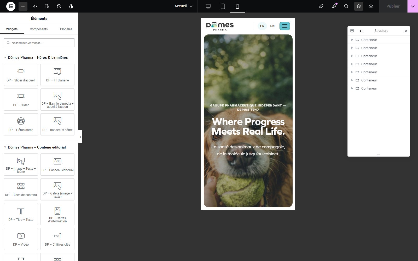
The top bar provides access to Ajouter un élément, page settings, history, desktop and mobile views, Structure, preview and saving. Exact positions depend on the window width.
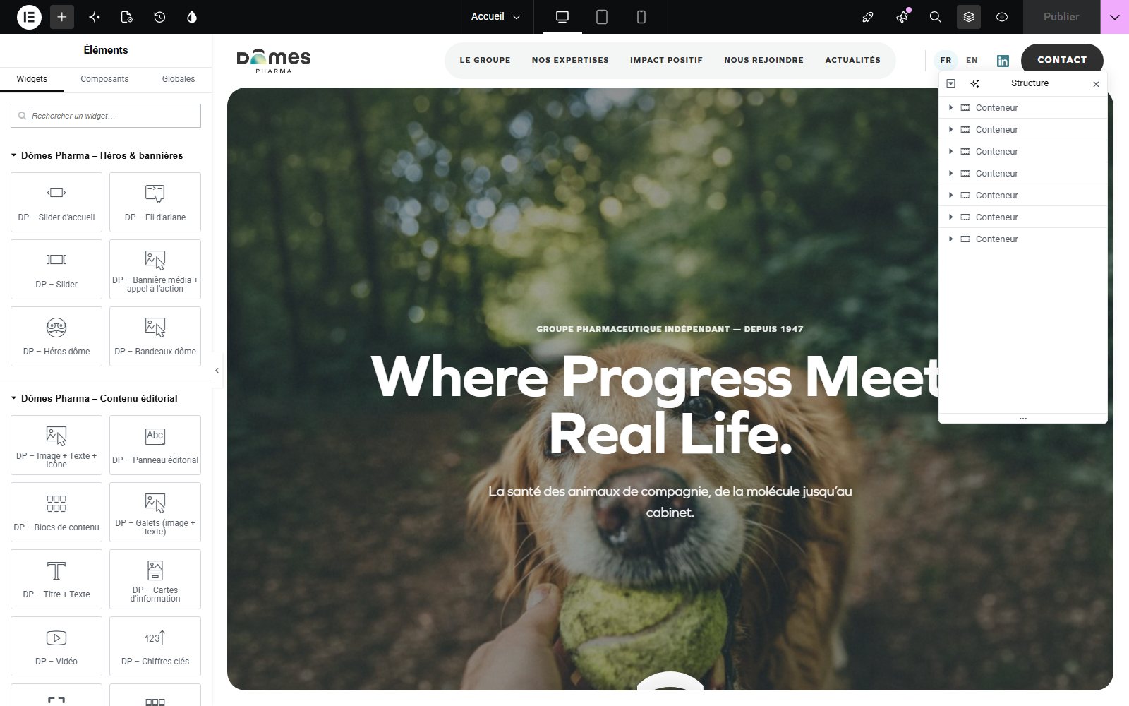
The left panel shows either available widgets or the settings of the selected element. The preview shows the page. Structure displays the hierarchy of containers and widgets: expand a container and select its child. Give containers useful names such as Introduction or Resources when the rename command is available.
Within a widget, Contenu holds text, images, links and lists. Style controls the widget’s appearance. Avancé includes spacing and visibility. Always start with Contenu. Some fields appear only after a particular design, source or option is selected.
Edit text and buttons
- Select the widget in the preview or Structure.
- Under Contenu, locate Titre, Texte, Description or the equivalent field. Replace the content without inserting unnecessary line breaks.
- Prefer pasting plain text to avoid importing fonts and colours from Word.
- Write a heading that explains the subject. Give the page a coherent main heading, then use H2 for major sections and H3 for subsections. Heading tags describe structure, not just visual size.
- For a button, complete both its text and its destination. Prefer Explore our careers to Click here.
- Preview the page and follow the link to check its destination and language.
An empty field may hide a button or leave space, depending on the widget. Remove actions that are no longer needed. An address containing only # is a demonstration placeholder, not a destination ready for publication.
Choose and replace images
Click the image in the widget settings and select an existing media item, or upload an authorised file. Use a meaningful filename and approved imagery for the new identity. Avoid images containing text if that text needs to vary by language.
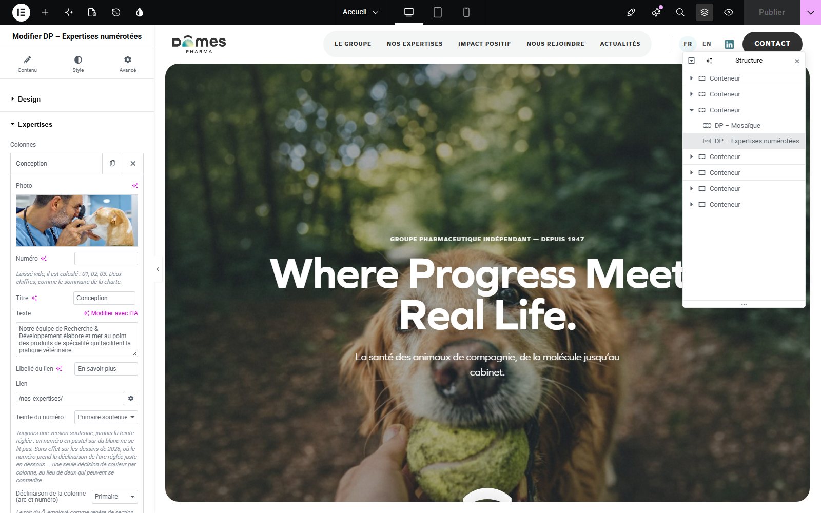
Alternative text describes useful information, for example A veterinarian examining a dog. A purely decorative image does not need an artificial description. Alternative text, visible captions and filenames have different purposes.
Remplir or Cover crops an image to fill its area. Contenir or Contain displays the whole image but may leave empty space. For a product or logo, make sure nothing important is cut off. For a photograph, adjust its focal position and check faces on mobile.
If the widget offers a mobile image, provide a suitable crop. Otherwise, choose a photograph that works at different proportions. Editing shared media information can affect other uses of that media; replacing an image in a widget does not delete the original file from the library.
Add and organise widgets
Open Ajouter un élément and search for DP or a word from the widget’s name. Widgets are grouped into six families covering heroes and banners, editorial content, products and catalogues, team and trust, conversion and services, and blog and resources. Drag the widget into the intended container and check the insertion marker before dropping it.
To reuse a similar composition, right-click the widget or container and choose Dupliquer. Then replace every relevant text, image and link in the copy. Duplicating a container also duplicates its children. Use Structure to move elements accurately on long pages.
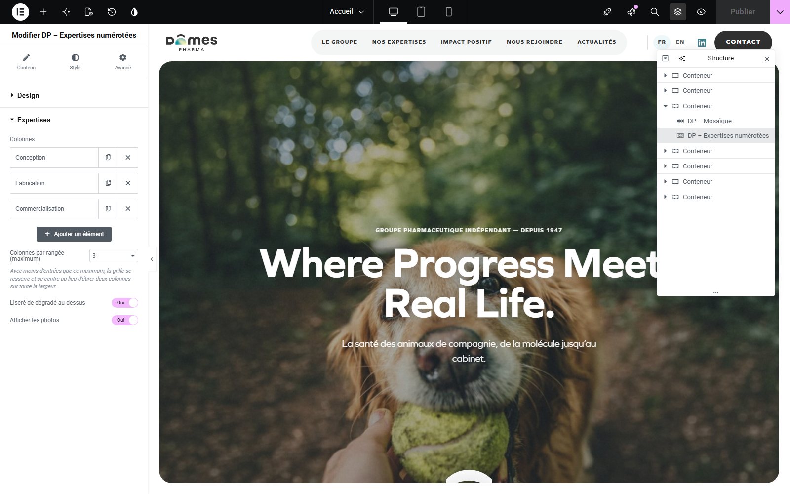
A repeating list contains entries such as slides, questions, cards or documents. Open an entry to edit it. Ajouter un élément adds an entry within the widget; Dupliquer copies it; Retirer removes it. Reorder rows by dragging when their handle is available.
Choose a design without rebuilding the content
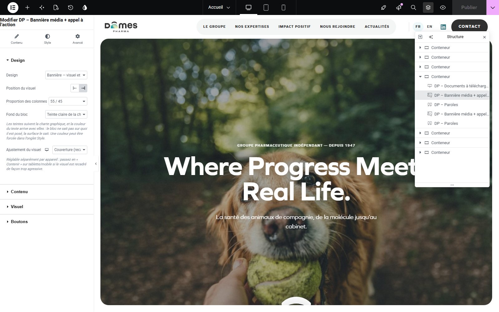
Select the widget and look for Design or Disposition under Contenu, sometimes under Style. Choose a variant and compare it using the same text. Cards support quick comparison; lists accommodate more entries; large images work well with a short message. Use the appendices to compare layouts before changing a page.
Changing design can reveal or hide settings and content. Check images, descriptions, buttons, columns and heights. A widget’s name describes its usual purpose but does not limit every use: Expertises numérotées can show three steps in a process; Paroles can feature an employee quotation; Accès rapides can become a page directory.
Keep a consistent visual hierarchy. A strong opening, readable sections and a clear next action usually work better than repeated large effects. Use the supplied surfaces and options without rebuilding the brand system.
Control containers and spacing
Use a container to organise several widgets together: horizontal or vertical direction, width, alignment and space between items. On an existing page, keep the original structure initially. A Dômes Pharma widget may already manage its own columns; placing it inside several additional columns often makes it too narrow.
Margin is space outside an element. Padding is space between its edge and its content. A container’s gap separates its children. Correct spacing where it originates instead of adding Spacer widgets throughout the page.
Under Avancé, values may be linked across the four sides. Unlink them only when different values are needed. Check the device icon before changing a responsive value. Avoid fixed heights for text-heavy sections: a longer translation could be clipped.
Do not change the page template at random. Elementor Canvas, for example, can remove the header and footer. Keep the template defined for the site.
Check desktop tablet and mobile
- Complete the desktop structure first.
- Switch to tablet and then mobile using the top bar.
- Check headings, image cropping, column order, button width and spacing.
- When a setting has a device icon, adjust the value for the selected device. Ordinary text and links generally remain shared across all three views.
- Preview outside the editor and also test a genuinely narrow window or a phone.
Values from larger screens can be inherited by smaller screens. A mobile override may explain why a desktop change does not carry through. Reset the relevant override instead of changing several unrelated values.
Do not hide essential information merely to make a page fit. Large grids often wrap automatically. Slides and accordions must remain usable by touch with visible controls.
Recognise automatically populated content
A manual widget contains its own entries, such as Questions fréquentes, Documents à télécharger or Équipe et KOL. A dynamic widget retrieves records maintained elsewhere, such as Articles du blog, Grille produits or Cartes de contacts. Some widgets, including Catégories and Mosaïque, offer several sources.
To correct a news item, open its source post and check the title, excerpt, featured image and category. To correct product information, open the relevant product. To change the number or order of displayed cards, return to the Elementor widget and its filters. The same source can appear on multiple pages.
If a list is empty, check in this order: published content, correct language, selected source, filters, item count and the option to hide empty categories. A published record without the expected category may be excluded. Ask the administrator for missing categories rather than creating new ones to work around a filter.
Automatic colours and pictograms come from the site’s prepared settings. Selecting an existing range does not mean changing its configuration.
Work with French Spanish and English pages
The interface language, a page’s language and a visitor’s language are separate concepts. The French screenshots help you locate commands; they do not prescribe the language of your content.
In WordPress, locate Polylang’s language columns or language panel. A pencil opens an existing translation; a plus sign starts one when that option is available. Check the connection to the correct source page. If Spanish is unavailable on your site, ask the administrator to enable it.
After reusing the structure, translate headings, paragraphs, buttons, captions, alternative text, questions, empty-state messages, filters and documents. Replace links with destinations in the target language. Check automatically displayed posts and products: translating the widget heading does not translate its sources.
Review each language separately on mobile. Headings and buttons take up different amounts of space. Do not assume a French change is reproduced in English or Spanish: each page needs checking and saving according to the site’s workflow.
Manage documents videos and resources
For a short list of documents on a page, choose Documents à télécharger. Add an entry, its title, a useful description and a file or URL. The format is normally inferred from the destination. For a library with categories and search, use Bibliothèque de ressources and fill in its entries; do not assume it automatically imports the entire media library.
A veterinary-only document must use the site’s approved protection mechanism. Check it with an authorised account and as a signed-out visitor. A visible padlock alone does not validate every case, particularly external links. Ask the administrator to check any destination whose protection is unclear.
For video, select the appropriate source, link or file, a cover image and a caption. Prefer playback initiated by the visitor. Add subtitles on the video platform when they are needed for understanding. Test playback, any close action and the mobile display.
Use forms and specialist journeys
In Formulaire, check visible fields, labels, required fields, button text and approved consent wording. In Newsletter, adapt the invitation and visible messages. Message routing and service connections must remain consistent with the configuration provided by the administrator.
A submission test sends a real message or subscription request. Run it only within the agreed test process, using a test address and an informed recipient. Check validation errors, confirmation and receipt: an on-page success message alone does not prove that the email arrived.
Questionnaire can combine answers, a passing threshold and a certificate. A correct answer is marked with an asterisk at the start of its line in Réponses. Have the questions and learning journey approved; do not change an existing certificate or threshold without understanding its purpose.
Connexion Vet Vault displays different states depending on the visitor’s login and access rights. Resources, courses and ordering widgets must be reviewed in the intended user context, not only from an administrator session.
Save preview and publish
Prévisualiser les changements opens a review view; it does not replace saving. For a new page awaiting approval, use the save options to keep a draft. On an existing live page, publishing or updating may make changes visible immediately.
Before publishing, check the page title and language, every link, mobile layout and required notices. Review the status and options next to the main button. In the observed version the button may say Publier; other versions show Mettre à jour for an existing page.
After saving, wait for confirmation, then open and refresh the public page. If old content remains, first check the address and language, then reload without cache. Ask the responsible person to clear the cache if needed instead of deleting the widget.
For a substantial redesign without changing the live page, use the preparation environment or an approved working copy. A draft, an autosave and an independent copy are not interchangeable.
Undo changes and solve common problems
For a recent mistake, use Undo or Ctrl + Z in the editor context. Historique lets you review session actions and available saved revisions. Identify the correct version before applying it, then check the restored page. Revisions do not replace a full site backup.
Missing widget: search for a simple word from its name and open the relevant Dômes Pharma family. Missing field: check the design and options controlling its visibility. Empty list: check source, language and filters. Cropped image: compare Cover and Contain, then adjust positioning. Large gap: inspect margin, padding, height and parent container. Inactive button: check the destination and any file mode.
If saving fails, leave the editor open and record the exact message. Avoid repeatedly pressing Publish. Send the administrator the URL, language, widget name, action taken and a screenshot. Do not change plugins or site settings to try to fix a page.
Build creative pages
A careers page can combine Titre + Texte, Galets for roles, Paroles for a testimonial, Questions fréquentes and a Bannière média leading to vacancies. A commitment page can combine Manifeste, Chiffres clés, Expertises numérotées for project stages and Documents à télécharger for the report.
A range page can use Présentation de gamme, Grille produits filtered to an existing range, Détails produit only in the appropriate context, and Documents à télécharger. An event page can combine a Bannière média, Événements, Équipe et KOL for speakers and a prepared Formulaire.
Start by writing the page’s purpose and intended next action. Then choose widgets that tell that story. Keep automatic catalogue widgets connected to their intended sources; use manual widgets when adapting a composition to a different subject.
Exercise: in a working page, present a project using Titre + Texte, three Expertises numérotées and a button. Try two expertise designs with the same text. Keep the one that remains readable on mobile, then have the page reviewed before publication.
Final checklist and glossary
- The correct page and language are open; old logos and imagery have been replaced.
- Text has been reviewed, figures approved and headings organised logically.
- Images are sharp and properly cropped; alternative text is useful.
- Buttons, documents, internal links and translation links have been tested.
- Automatic lists show the intended sources; no demonstration content remains.
- Mobile content is readable, controls are accessible and forms have been tested within the agreed process.
- Editorial approval has been obtained and the public page checked after saving.
Widget or block: a content element. Container: a group arranging widgets. Repeater: a list of entries inside a widget. Design: a visual variant. Responsive: adapting to screen sizes. CTA: a link or button inviting action. Dynamic source: content retrieved from WordPress. Draft: unpublished content. Revision: a saved version available for restoration. Anchor: a reference allowing a link to reach a section of a page.
References and version
Widget, design and setting names come from the Dômes Pharma 3.62.0 plugin installed on the test site. Interface reference: Elementor 4.2.4 and Elementor Pro 4.2.3. General procedures are also covered in the following official documentation.
- Elementor — Preview and publish
- Elementor — Page structure
- Elementor — Responsive editing
- Elementor — Revision history
- WordPress — Media
- WordPress — Revisions
21/09/2026 · Dômes Pharma Elementor 3.62.0