Editorial content
DP – Panneau éditorial
Builds a panel from Modules: heading, text, photograph, pills and actions. Add modules in reading order and set their desktop, tablet and mobile widths. Use for a manifesto, portrait or argument. Two 50% modules can share a row; check wrapping and Commencer une nouvelle ligne.
What you fill in
The content fields of this widget, in the order of the Elementor panel. Appearance settings are gathered in the reference.
Composition du panneau
| Label in the plugin | How to complete it |
|---|---|
| Modules | L’ordre des modules est conservé sur tous les écrans. Les pastilles et les actions utilisent les réglages ci-dessous ; seul leur premier emplacement est affiché. |
| ↳ Module | Choose an available option and check its effect in the preview. Options: En-tête · Texte · Photo · Pastilles · Actions. |
| ↳ Sur-titre | Enter short, clear text. Visible when “Module” is En-tête. |
| ↳ Titre | Enter the text, then check its length in the preview. Visible when “Module” is En-tête. |
| ↳ Texte | Write the content and use restrained formatting. Visible when “Module” is Texte. |
| ↳ Balise du titre | Choose an available option and check its effect in the preview. Options: H1 · H2 · H3 · H4 · H5 · H6 · P. Visible when “Module” is En-tête. |
| ↳ Photo | Choose the appropriate media file and check the result. Visible when “Module” is Photo. |
| ↳ Photo mobile | Choose the appropriate media file and check the result. Visible when “Module” is Photo. |
| ↳ Texte alternatif | Enter short, clear text. Visible when “Module” is Photo. |
| ↳ Légende | Enter the text, then check its length in the preview. Visible when “Module” is Photo. |
| ↳ Lien | Enter the full destination and test the link in the correct language. Visible when “Module” is Photo. |
| ↳ Cadrage | Choose an available option and check its effect in the preview. Options: Remplir · Contenir. Visible when “Module” is Photo. |
| ↳ Largeur — Ordinateur | Choose an available option and check its effect in the preview. Options: 100 % · 75 % · 66 % · 50 % · 33 % · 25 %. |
| ↳ Position photo — Ordinateur | Choose an available option and check its effect in the preview. Options: Centre · Gauche · Droite · Haut · Bas. Visible when “Module” is Photo. |
| ↳ Hauteur photo (px) — Ordinateur | Enter a value suitable for the content and check the result. Visible when “Module” is Photo. |
| ↳ Largeur — Tablette | Choose an available option and check its effect in the preview. Options: 100 % · 75 % · 66 % · 50 % · 33 % · 25 %. |
| ↳ Position photo — Tablette | Choose an available option and check its effect in the preview. Options: Centre · Gauche · Droite · Haut · Bas. Visible when “Module” is Photo. |
| ↳ Hauteur photo (px) — Tablette | Empty: the design value applies. Visible when “Module” is Photo. |
| ↳ Largeur — Mobile | Choose an available option and check its effect in the preview. Options: 100 % · 75 % · 66 % · 50 % · 33 % · 25 %. |
| ↳ Position photo — Mobile | Choose an available option and check its effect in the preview. Options: Centre · Gauche · Droite · Haut · Bas. Visible when “Module” is Photo. |
| ↳ Hauteur photo (px) — Mobile | Empty: the design value applies. Visible when “Module” is Photo. |
| ↳ Rayon de la photo | From 0 to 200 px. Empty: the design value applies. Visible when “Module” is Photo. |
| ↳ Commencer une nouvelle ligne | Turn the option on or off, then check what appears. |
| ↳ Alignement horizontal | Choose an available option and check its effect in the preview. Options: Hériter du panneau · Gauche · Centre · Droite. |
| ↳ Alignement vertical | Choose an available option and check its effect in the preview. Options: Haut · Centre · Bas · Étirer. |
Pastilles et actions
| Label in the plugin | How to complete it |
|---|---|
| Mots en pastilles | Open each entry; add, duplicate or reorder the items you need. |
| ↳ Mot | Enter short, clear text. |
| ↳ Couleur | Choose an available option and check its effect in the preview. Options: Automatique — les quatre couleurs à la suite · Primaire · Secondaire · Tertiaire · Quaternaire. |
| Bouton principal | Enter short, clear text. |
| Lien du bouton principal | Enter the full destination and test the link in the correct language. |
| Bouton secondaire | Enter short, clear text. |
| Lien du bouton secondaire | Enter the full destination and test the link in the correct language. |
Mise en page
| Label in the plugin | How to complete it |
|---|---|
| Fond autour du panneau | Le dégradé porte le grain de la charte, réglé une fois pour tout le site dans Produits → Charte graphique. Options: Maillage de dégradé · Dégradé linéaire de la charte · Dégradé du dôme · Dégradé très clair · Teinte primaire · Teinte secondaire · Teinte tertiaire · Teinte quaternaire …. |
| Alignement du contenu | Choose an available option and check its effect in the preview. Options: Centré — la maquette · À gauche. |
Available designs
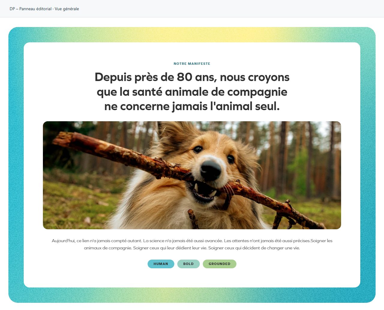
Overall view
Overall widget view. Use the content and options explained in this entry to adapt it to your page.