Heroes and banners
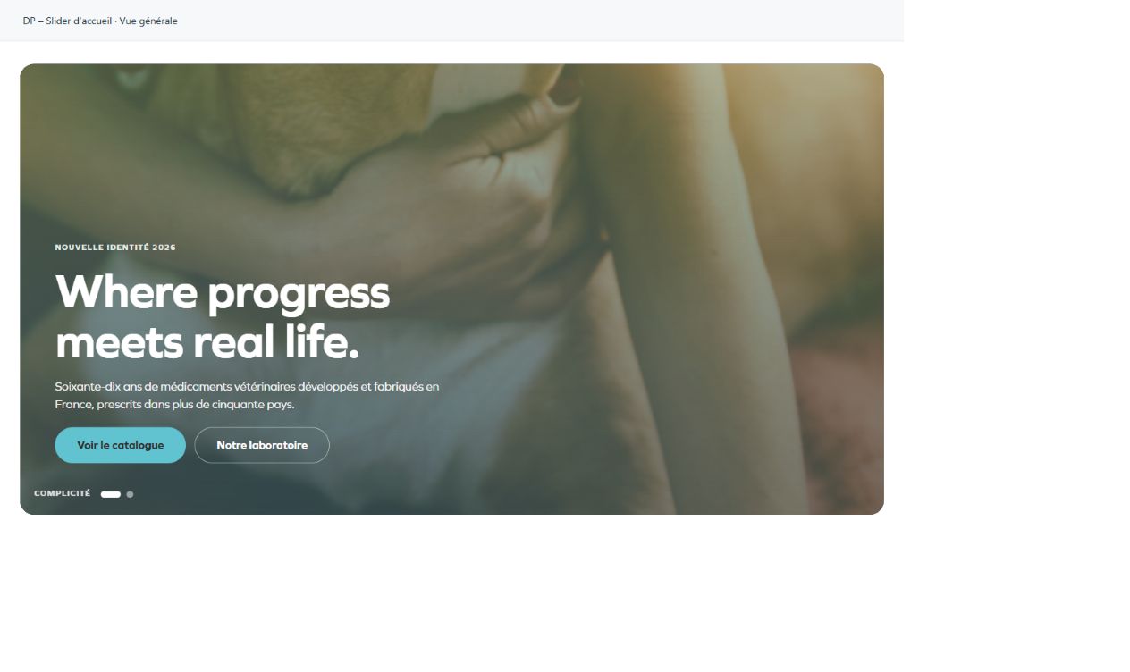
DP – Slider d'accueil
Opens a page with several photographic slides. Open Vues and complete each image and its text, then set dots, arrows and duration. Use it for commitments or campaigns. Each slide should make sense independently; test navigation and avoid rotation that forces visitors to read too quickly.
What you fill in
The content fields of this widget, in the order of the Elementor panel. Appearance settings are gathered in the reference.
Vues
| Label in the plugin | How to complete it |
|---|---|
| Vues | Open each entry; add, duplicate or reorder the items you need. |
| ↳ Photo | Choose the appropriate media file and check the result. |
| ↳ Description de la photo | Lue par les lecteurs d'écran. Laissée vide, la photo est traitée comme décorative — ce qui est le bon choix ici, le sens étant porté par le texte. |
| ↳ Sur-titre | Enter short, clear text. |
| ↳ Titre | Enter the text, then check its length in the preview. |
| ↳ Texte | Enter the text, then check its length in the preview. |
| ↳ Bouton principal | Enter short, clear text. |
| ↳ Lien du bouton principal | Enter the full destination and test the link in the correct language. |
| ↳ Bouton secondaire | Enter short, clear text. |
| ↳ Lien du bouton secondaire | Enter the full destination and test the link in the correct language. |
| ↳ Légende | Un mot, en capitales, à côté des puces. |
Défilement
| Label in the plugin | How to complete it |
|---|---|
| Défilement automatique | Turn the option on or off, then check what appears. |
| Durée d'affichage d'une vue | From 2500 to 15000 ms. Adjust gradually; check the target device before changing it. Visible when “Défilement automatique” is enabled. |
| Reprendre la vue au rechargement | Le carrousel reprend la vue affichée avant le rechargement, le temps de l'onglet. |
| Puces et légende | Turn the option on or off, then check what appears. |
| Flèches | Turn the option on or off, then check what appears. |
Mise en page
| Label in the plugin | How to complete it |
|---|---|
| Toute la hauteur de l'écran | La hauteur suit la fenêtre, barre d'adresse comprise sur téléphone. Décoché, le panneau prend la hauteur réglée ci-dessous. |
| Hauteur à retrancher | Ce qui surmonte le héros et doit rester visible : un en-tête collé, un bandeau. Le panneau tient alors dans ce qu'il reste de la fenêtre. Visible when “Toute la hauteur de l'écran” is enabled. |
| Hauteur du panneau | From 280 to 1200 px. Empty: the design value applies. Visible when “Toute la hauteur de l'écran” is disabled. |
| Position du texte | Choose an available option and check its effect in the preview. Options: En bas à gauche — la maquette · Centré · À mi-hauteur, à gauche. |
| Balise du titre | H1 sur la page d'accueil, H2 partout où un autre titre le précède. Options: H1 · H2 · H3 · div. |
Available designs
Overall view
Overall widget view. Use the content and options explained in this entry to adapt it to your page.