Editorial content
DP – Cartes d'information
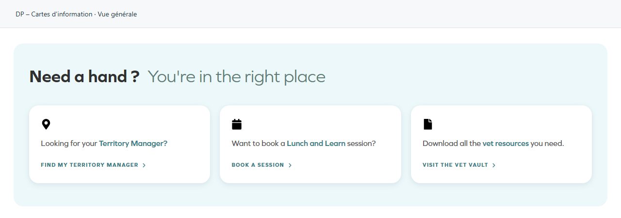
Presents short information in cards. Complete the group heading and Cartes. Suitable for benefits, commitments, services or practical guidance. Give each card one identifiable idea; balance text lengths and check readability against the supplied backgrounds.
What you fill in
The content fields of this widget, in the order of the Elementor panel. Appearance settings are gathered in the reference.
En-tête
| Label in the plugin | How to complete it |
|---|---|
| Texte principal (gras) | Enter short, clear text. |
| Texte secondaire (clair) | Enter short, clear text. |
| Palette | La charte fait suivre les accents au réglage Produits → Charte graphique. « Couleurs historiques » rétablit l'orange et le bleu d'origine. Une couleur choisie carte par carte reste prioritaire dans les deux cas. Options: Charte graphique · Couleurs historiques (orange / bleu). |
| Balise de titre | Choose an available option and check its effect in the preview. Options: H1 · H2 · H3 · H4 · div. |
Cartes
| Label in the plugin | How to complete it |
|---|---|
| Cartes | Open each entry; add, duplicate or reorder the items you need. |
| ↳ Icône | Choose an understandable icon that matches the subject. |
| ↳ Couleur de l'icône | Empty: the design colour applies. Check the contrast against the background. |
| ↳ Texte avant la partie colorée | Enter short, clear text. |
| ↳ Texte mis en avant (coloré) | Enter short, clear text. |
| ↳ Couleur du texte mis en avant | Empty: the design colour applies. Check the contrast against the background. |
| ↳ Texte après la partie colorée | Enter short, clear text. |
| ↳ Texte du lien | Enter short, clear text. |
| ↳ URL du lien | Enter the full destination and test the link in the correct language. |
| ↳ Couleur du lien | Empty: the design colour applies. Check the contrast against the background. |
Available designs
Overall view
Overall widget view. Use the content and options explained in this entry to adapt it to your page.