DP – Bannière média + appel à l’action
Combines a strong message, image and action. Choose among six designs, enter heading, text and buttons, then set the primary destination as link or file. Promote a report, campaign or application. Check contrast, mobile cropping and the actual action destination.
What you fill in
The content fields of this widget, in the order of the Elementor panel. Appearance settings are gathered in the reference.
Design
| Label in the plugin | How to complete it |
|---|---|
| Design | Choose an available option and check its effect in the preview. Options: Bannière — visuel et contenu côte à côte · Overlay — contenu posé sur le visuel · Bande — grand titre à gauche, texte et action à droite · Bande compacte — tout sur une ligne · Arche — visuel en arche, points clés en pastilles pastel · Affiche — visuel plein cadre, contenu centré. |
| Logo au-dessus du contenu | Le logotype en négatif, posé sur le visuel. À réserver aux affiches de fin de page : deux logos sur un même écran, celui de l'en-tête et celui-ci, se concurrencent. Visible when “Design” is Affiche, Overlay. |
| Position du visuel | Choose a position or alignment that supports reading. Options: Gauche · Droite. Visible when “Design” is Bannière, Bande compacte, Arche. |
| Proportion des colonnes | Choose an available option and check its effect in the preview. Options: 60 / 40 — priorité au texte · 55 / 45 · 50 / 50 · 45 / 55 · 40 / 60 — priorité au visuel. Visible when “Design” is Bannière, Arche, Bande. |
| Fond du bloc | Les teintes suivent la charte graphique, et la couleur du texte arrive avec elles : le bloc ne sait pas sur quoi il est posé, la surface le sait. Une couleur peut être forcée dans l’onglet Style. Options: Teinte claire de la charte · Blanc avec bordure · Gris très clair · Transparent · Teinte primaire — aplat plein · Teinte secondaire — aplat plein · Teinte tertiaire — aplat plein · Teinte quaternaire — aplat plein …. Visible when “Design” is not Overlay. |
| Alignement des deux colonnes | Choose an available option and check its effect in the preview. Options: Par le bas — la maquette · Par le milieu · Par le haut · Étirées. Visible when “Design” is Bande. |
| Sens du voile | Choose an available option and check its effect in the preview. Options: Latéral — du côté du texte · Par le bas · Uniforme. Visible when “Design” is Overlay. |
| Position du contenu | Choose a position or alignment that supports reading. Options: Gauche · Centre · Droite. Visible when “Design” is Overlay. |
| Hauteur du contenu | Choose a position or alignment that supports reading. Options: Haut · Milieu · Bas. Visible when “Design” is Overlay. |
| Ajustement du visuel | Réglable séparément par appareil : passez en « Contenir » sur tablette/mobile si le visuel est recadré de façon trop agressive. Options: Couverture (recadré) · Contenir (entier, packshot). Visible when “Design” is not Overlay. |
| Halo coloré derrière le visuel | Détache un packshot sur fond clair. Visible when “Design” is Bannière and “Ajustement du visuel” is Contenir (entier, packshot). |
Contenu
| Label in the plugin | How to complete it |
|---|---|
| Badge | Enter short, clear text. |
| Sur-titre | Enter short, clear text. |
| Titre | Enter short, clear text. |
| Niveau de titre | Choose an available option and check its effect in the preview. Options: H1 · H2 · H3 · H4 · Aucun (texte simple). |
| Texte | Write the content and use restrained formatting. |
| Puce des points clés | Choose an available option and check its effect in the preview. Options: Coche · Arc du Ô — le petit chapeau · Point · Aucune. |
| Taille de la puce | From 8 to 40 px. Empty: the design value applies. Visible when “Puce des points clés” is not Aucune. |
| Points clés | Open each entry; add, duplicate or reorder the items you need. |
| ↳ Texte du point | Enter short, clear text. |
Visuel
| Label in the plugin | How to complete it |
|---|---|
| Image | Choose the appropriate media file and check the result. |
| Texte alternatif | Vide = le texte alternatif de la médiathèque. Laissez vide si l’image est purement décorative. |
| Image — tablette (optionnel) | Remplace l’image ci-dessus sur tablette (≤ 1024px). Utile pour poser un cadrage différent (ex. portrait sur desktop, paysage sur tablette) plutôt que de recadrer la même image. |
| Image — mobile (optionnel) | Remplace l’image ci-dessus sur mobile (≤ 640px). Vide = reprend l’image tablette, ou l’image principale si aucune n’est définie. |
| Cadrage du visuel | Choose an available option and check its effect in the preview. Options: Haut gauche · Haut centre · Haut droite · Milieu gauche · Milieu centre · Milieu droite · Bas gauche · Bas centre …. |
| Hauteur du visuel | Laissez vide pour garder la hauteur par défaut. Utile sur tablette/mobile pour éviter un visuel trop grand ou trop coupé. Visible when “Design” is Bannière. |
Boutons
| Label in the plugin | How to complete it |
|---|---|
| Bouton principal — texte | Enter short, clear text. |
| Bouton principal — cible | Choose an available option and check its effect in the preview. Options: Un fichier de la médiathèque · Un lien. |
| Fichier à télécharger | Choose the appropriate media file and check the result. Visible when “Bouton principal — cible” is Un fichier de la médiathèque. |
| Bouton principal — lien | Enter the full destination and test the link in the correct language. Visible when “Bouton principal — cible” is Un lien. |
| Afficher le format et le poids du fichier | Turn the option on or off, then check what appears. Visible when “Bouton principal — cible” is Un fichier de la médiathèque. |
| Bouton principal — aplat | Choose an available option and check its effect in the preview. Options: Automatique — selon le fond du bloc · Aplat de marque · Encre · Blanc. |
| Bouton secondaire — texte | Enter short, clear text. |
| Bouton secondaire — lien | Enter the full destination and test the link in the correct language. |
Available designs
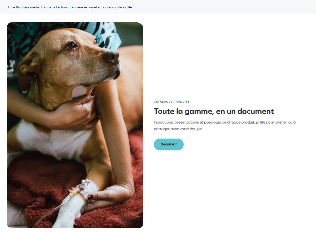
Bannière — visuel et contenu côte à côte
A banner draws attention to one main message. Keep heading, text and action clearly prioritised.
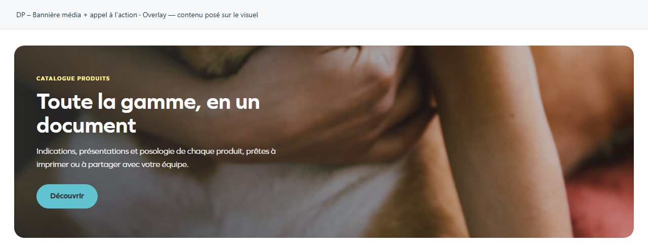
Overlay — contenu posé sur le visuel
Text overlays the image. A quiet area behind the words improves readability.
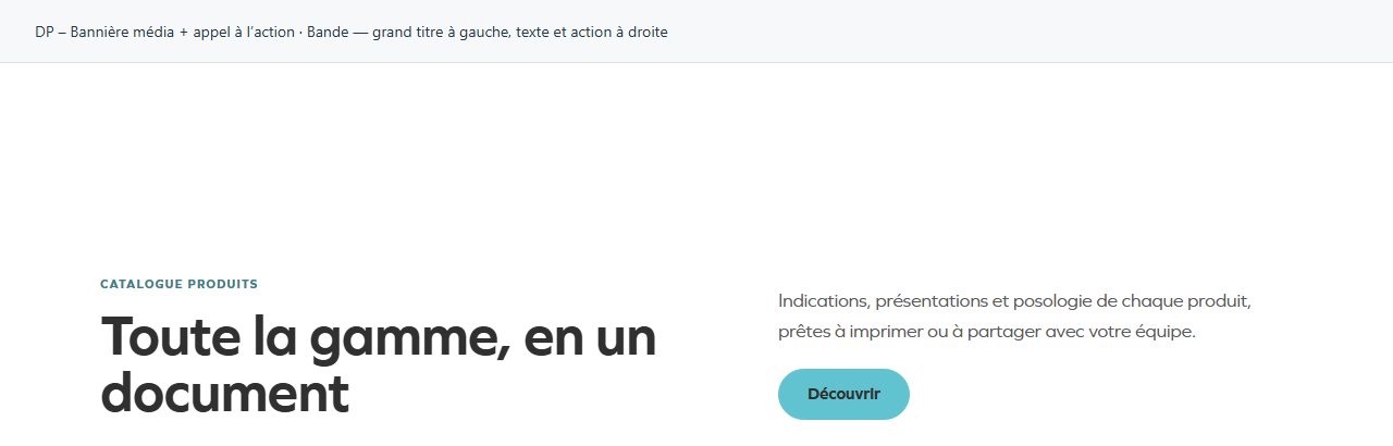
Bande — grand titre à gauche, texte et action à droite
Large heading on one side, explanation and action on the other. Suitable for a strong invitation without a large image.
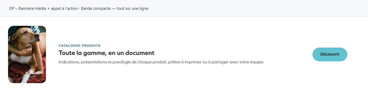
Bande compacte — tout sur une ligne
Compact strip for use between sections or at the end. Keep the message short.
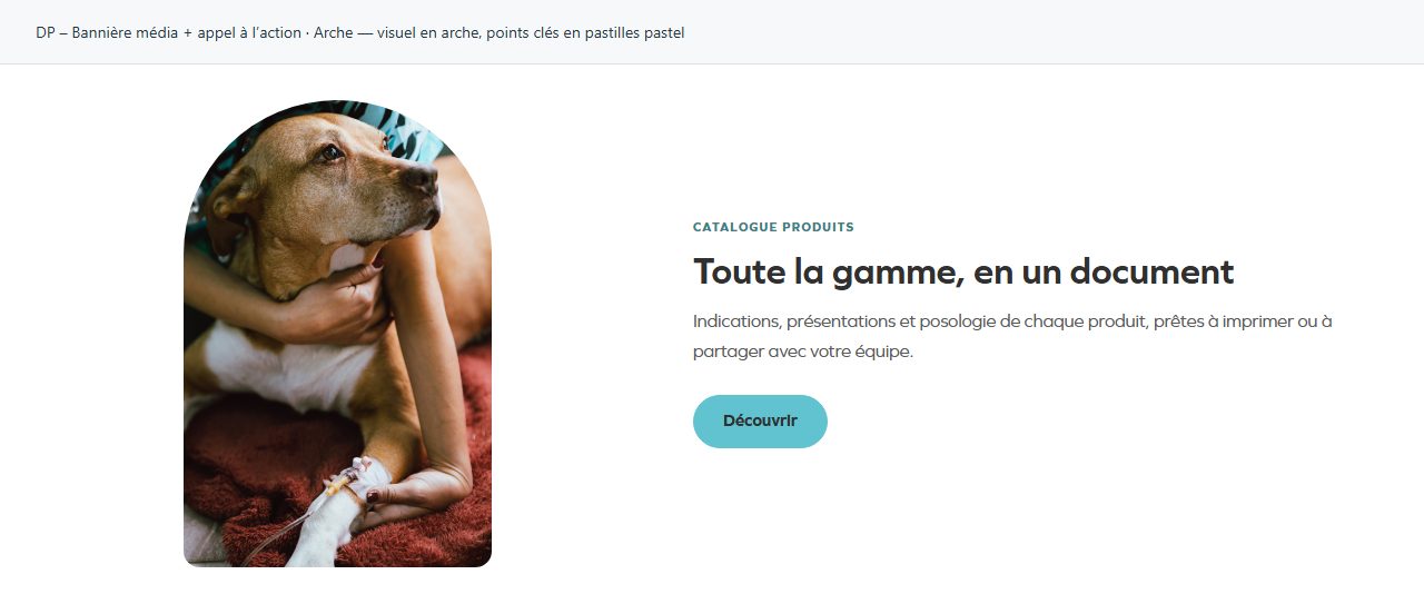
Arche — visuel en arche, points clés en pastilles pastel
Arched image. Check the useful area of the photograph and its balance with text.
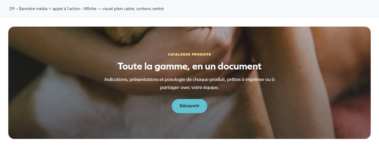
Affiche — visuel plein cadre, contenu centré
Full-frame image with centred content. Suitable for a short, prominent announcement.