Conversion and services
DP – Accès rapides
Directs visitors to a few priority destinations. Add titles, descriptions and links, then choose Bande, Cartes or Numéroté. Use as a directory, service journey or resource selection. Keep labels distinct and ensure numbers represent a meaningful sequence when a progression is promised.
What you fill in
The content fields of this widget, in the order of the Elementor panel. Appearance settings are gathered in the reference.
Design
| Label in the plugin | How to complete it |
|---|---|
| Design | Choose an available option and check its effect in the preview. Options: Bande — entrées séparées par un filet · Cartes — blocs détachés · Numéroté — parcours 01 / 02 / 03. |
| Entrées par rangée (maximum) | Avec moins d’entrées que ce maximum, la rangée se resserre et se centre. Options: 2 · 3 · 4. |
| Largeur maximale d’une entrée | From 200 to 640 px. Adjust gradually; check the target device before changing it. |
| Présentation de l’icône | Choose an available option and check its effect in the preview. Options: Pastille teintée · Pastille pleine · Icône seule · Sans icône. Visible when “Design” is not Numéroté. |
| Repère des entrées | Choose an available option and check its effect in the preview. Options: Numéro — 01 / 02 / 03 · Picto de la charte · L’icône choisie sur l’entrée. Visible when “Design” is Numéroté. |
| Coloris des pictos | Le coloris est un fichier, pas un filtre : recolorer un picto en CSS salit la silhouette. Options: Encre · Bleu · Menthe · Vert · Jaune. Visible when “Design” is Numéroté and “Repère des entrées” is Picto de la charte. |
| Arc du Ô au-dessus du titre | Turn the option on or off, then check what appears. |
| Largeur de l’arc | From 20 to 120 px. Empty: the design value applies. Visible when “Arc du Ô au-dessus du titre” is enabled. |
| Afficher les descriptions | Turn the option on or off, then check what appears. |
| Afficher la flèche | Turn the option on or off, then check what appears. |
En-tête du bloc
| Label in the plugin | How to complete it |
|---|---|
| Sur-titre | Enter short, clear text. |
| Titre | Enter short, clear text. |
| Alignement de l’en-tête | Choose a position or alignment that supports reading. Options: Gauche · Centre. |
Entrées
| Label in the plugin | How to complete it |
|---|---|
| Liste des accès rapides | Open each entry; add, duplicate or reorder the items you need. |
| ↳ Icône | Choose an understandable icon that matches the subject. |
| ↳ Picto de la charte | Employé par le design numéroté quand son repère est réglé sur « Picto de la charte ». Options: Arc du Ô · Chien · Chat · Cheval. |
| ↳ Titre | Enter short, clear text. |
| ↳ Description | Enter the text, then check its length in the preview. |
| ↳ Lien | Enter the full destination and test the link in the correct language. |
| ↳ Texte du lien | Vide = seule la flèche est affichée. |
| ↳ Couleur d’accent | Empty: the design colour applies. Check the contrast against the background. |
Available designs
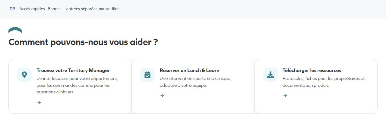
Bande — entrées séparées par un filet
Entries separated by rules within a strip. Use labels that are easy to compare.
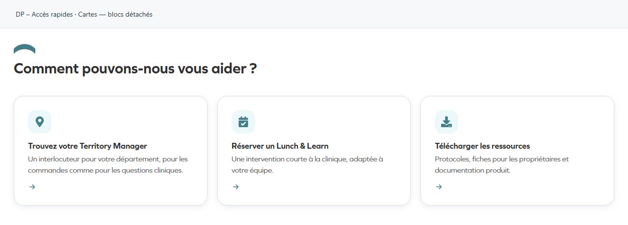
Cartes — blocs détachés
Separate cards make entries independent. Check balance and how many remain visible on small screens.
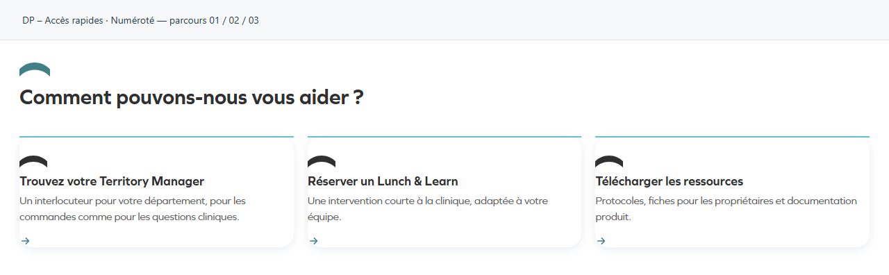
Numéroté — parcours 01 / 02 / 03
Numbers establish a reading order. Useful for clearly defined stages or priorities.