Editorial content
DP – Titre + Texte
Introduces a page or section with a heading and text. Complete Sur-titre, Titre, Texte and the heading tag; add useful buttons. Simple, Dôme and Grand titre change the visual emphasis. It can also close a page with an action; avoid multiple competing H1 headings.
What you fill in
The content fields of this widget, in the order of the Elementor panel. Appearance settings are gathered in the reference.
Contenu
| Label in the plugin | How to complete it |
|---|---|
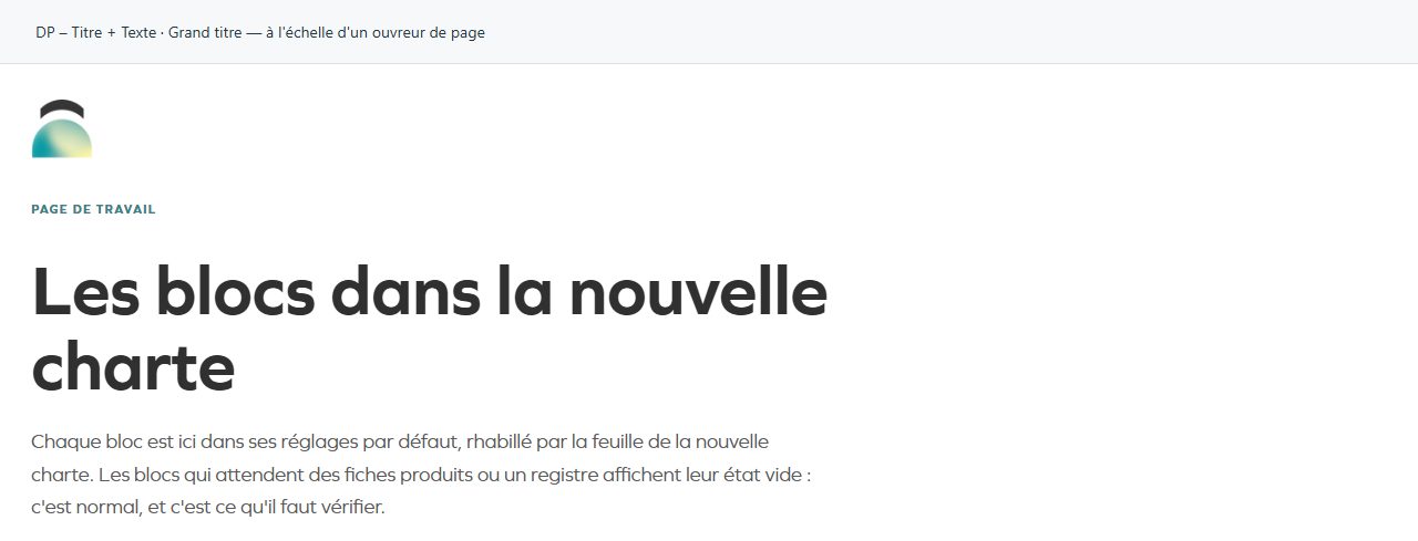
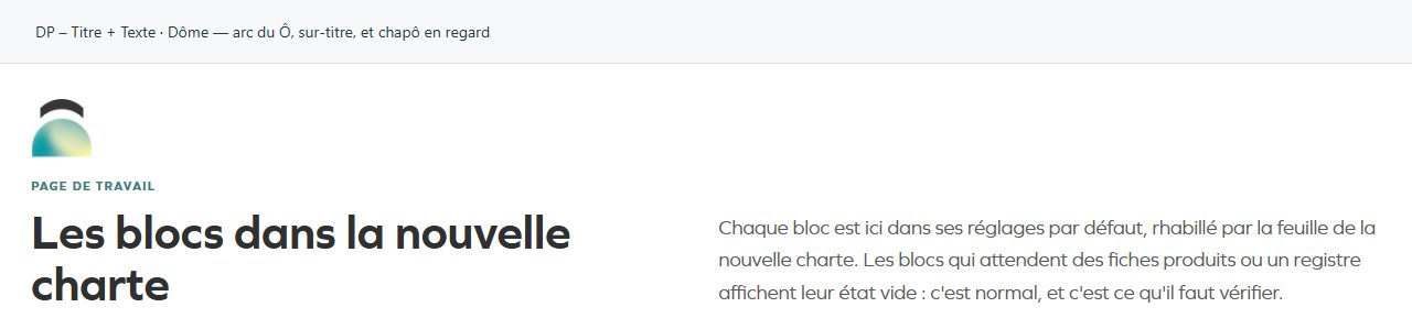
| Design | Dôme est le titre de section de la maquette : l'arc du Ô en tête, le titre à gauche et le chapô à droite, alignés par le bas. Grand titre est l'ouvreur de page du site groupe : un titre centré qui prend la largeur, et rien d'autre autour. Options: Simple — titre, filet, texte dessous · Dôme — arc du Ô, sur-titre, et chapô en regard · Grand titre — à l'échelle d'un ouvreur de page. |
| Sur-titre | Trois mots, en capitales. Visible when “Design” is Dôme, Grand titre. |
| Titre | Enter short, clear text. |
| Balise du titre | Choose an available option and check its effect in the preview. Options: H1 · H2 · H3 · H4 · H5 · H6. |
| Texte | Write the content and use restrained formatting. |
| Position du chapô | Déjà en une colonne sur mobile/tablette : ce réglage ne change le bureau que si vous voulez ce rendu partout. Options: À côté du titre · Sous le titre. Visible when “Design” is Dôme. |
| Afficher l'arc du Ô | Turn the option on or off, then check what appears. Visible when “Design” is Dôme, Grand titre. |
| Texte clair (sur photo ou panneau sombre) | À n'utiliser que sur une surface réellement sombre : une photo voilée ou un panneau en teinte profonde. Sur un pastel, le texte reste en encre. Visible when “Design” is Dôme, Grand titre. |
| Afficher le filet sous le titre | Turn the option on or off, then check what appears. Visible when “Design” is Simple. |
| Bouton principal — texte | Vide : aucun bouton. |
| Bouton principal — lien | Enter the full destination and test the link in the correct language. |
| Bouton secondaire — texte | Enter short, clear text. |
| Bouton secondaire — lien | Enter the full destination and test the link in the correct language. |
| Style des boutons | Le style vaut pour le bouton principal ; le secondaire prend toujours le contour, pour que les deux niveaux restent distincts. Options: Pilule pleine · Contour · Équerre — l'angle de la charte au survol. |
Available designs
Simple — titre, filet, texte dessous
Restrained presentation for direct reading, useful when the page already has a strong visual feature.

Dôme — arc du Ô, sur-titre, et chapô en regard
The dome silhouette becomes the visual marker. Check cropping within the rounded shape.
Grand titre — à l'échelle d'un ouvreur de page
Large opening heading. Prefer a short phrase and check mobile line breaks.